
Week 7
Week 1: The Freehand MX Interface
In class exercise: The wrench.
Assignment- Create a simple personal geometric logo using circles, squares and lines. (10%)
Week 3- Functional design : Symbols and Instances:
Assignment: Using paper, create a linear drawing of your personal home page.(10%)
Week 4- Functional Design: Importing bitmaps into FreeHand MX
Assignment: Create a comp of your personal Home Page in FreeHand MX (10%)
Assignment: Locate a logo that is particularly effective and be prepared to present it to the class.
Explain why it is so effective.
What message does it convey?
Are there any potential design issues involving its use in web media and what would
you do to resolve those issues. (5%)
Week 6- Dimensions of design: Logo creation in FreeHand
Assignment: Create a personal set of letters in FreeHand spelling out your last name. The largest inside square can be no more than ¼ of the full size letter and the maximum number of inside squares is 3.(10%)
Week 7/8- Typography
Assignment: Create a personal typographic logo. (10%)
Week 9- Forms and Structure: Grid-based interface design.
Assignment: Using a 3 X 4 grid, design a balanced personal home page. (10%)
Week 10- Icons and Symbols: Developing iconic interfaces for use in web pages and mobile devices.
Assignment: Create an interface for a Palm Pilot email application. (10%)
Week 11/12- Colour
Assignment: Analyse a web site using the principals covered over the past 12 weeks and prepare to present them to your classmates. (25%)
Week 13,14,15- Critiques
Weeks 13 and 14 will be presentations of sites from weeks 11 and 12. Week 15 will be presentations of project work done in class.
Video tour of the FreeHand Interface
Here's an Aqua button:
Done properly, typographic art is a powerful communications vehicle. The choice of font, layout and effect can instantly communicate a mood or message in a manner that can be more powerful than a series of photos or images. In this lesson we explore the use of a number of techniques designed to use words to convey meaning and mood. From the creation of a typographic logo and the design of a type-based splash screen to some of the special effects you can create in Flash, Freehand and Fireworks , you will discover how type sometimes just might be the way to go.
Let's start building stuff
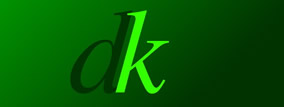
Dmitry Kirsanov's treatment of his logo.
For the past few years, I have been a regular visitor to the site of Dmitry Kirsanov, a writer, artist and web developer formerly based out of St. Petersburg, Russia but now located in Halifax, Nova Scotia. The simple linked "dk" is a classic example of the use of the proper font as a design element. The logo is composed of two letterforms - a " "d" and a "k" - which are linked at the serifs. Both letters are set in an "Italic" font. What makes this logo so compelling is the use of the gradient on a solid background to force the eye to the logo and the "serif" of the "d" which appears in front of the "k". The effect is one of a subtle interlinking of the two letters to create a "unified whole".
To give you an idea of the passion people bring to typography, the two letters created by Dmitry are actually composites of Times and Garamond Italic fonts. Dmitry, for example, borrowed the stem of the Garamond Italic "k" and "grafted parts of it onto the Times Italic letter. Then he started adjusting the width of the letters to achieve the "look" and "feel" he was seeking. Obviously, we can't do this here.
1. Open a new FreeHand document. Select the Rectangle tool and draw a rectangle on the page.
2. With the rectangle selected select click the Fill Tab in the Fill Panel and select Gradient from the Fill Options pop down.
3. When the Gradient panel opens click the chip on the left to open the Colour Chips. Select #009900 as the fill colour. Click the chip on the right side and set its Fill colour #003300. The gradient will fill the selected box. We want a shorter gradient distance between light and dark. Select the chip on the right and drag it to a position just a bit right of the center of the gradient line.
4. The Gradient wheel sets the angle of the gradient. Click on the knob and drag it down and to the right until the angle is 315 degrees. Your Gradient panels should resemble the one shown:
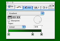
The FreeHand Gradient Panel. Colours are set by clicking the chips and selecting a colour from the resulting pop down palette. The gradient angle can be changed by the dragging handle in the gradient wheel.
5. Open the Layers Panel and add a new layer named "d".
6. Select the Text Tool click on the canvas and type a "d". Select the letter and, in the Text Inspector, set the font to Times Italic. Set the point size to 200 points and the colour to # 003300. Move the letter into position and lock the layer.
7. Add a new layer named "k", select the Text Tools, click on the page and add a lower case "k". Use the same formatting as the previous step except this letter's colour is #009900. Move this letter into place and deselect. When finished your image should resemble the one shown.
The letters are created and moved into their final position.
The text is currently in its postscript form. This is going to make it difficult to have the serif at the bottom of the "d" appear in front of the stem of the "k". This is where the strength of a vector application comes into play. You can "ply" with the vectors and still maintain all of the advantages of the vectors- crisp lines and scalability.
This occurs because Postscript fonts are composed of a bitmap letter and a vector letter. When a letter is converted to an outline the application uses the vector.
1. Lock the "k" Layer. Create a new layer named "piece". Select the text tool and create a letter "d" using the formatting presented earlier.
2. Switch to the Direct Selection tool and select the "d", Select Text, Covert to paths. The letter is now transformed into artwork.
3. Select the Magnifying Glass tool and "marquee" the letter to "zoom in" on it. Select the Keyline View and change your tool to the Subselect Tool. Click on the letter and you will see is now a collections of points, lines and curves as shown:
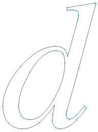
4. Select the "hole" in the "d" and delete it. Individually select the lines and points surrounding the serif shape and press the Delete key. When finished your "serif" should resemble:
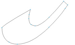
The finished serif.
5. Select Preview view and fill the shape with the dark green colour. Your finished logo and layers should resemble:
The completed letter pair.
6. Select the Text Tool and enter the following in upper case: DMITRY KIRSANOV STUDIO. Set the Font to Helvetica, the point size to 10 and the colour to black. Set the kerning amount to 31% and close the Text Editor. The final logo should resemble:
The completed logo.